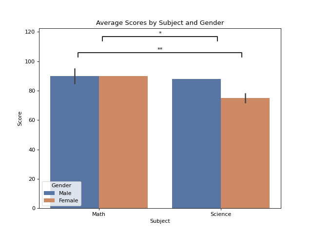
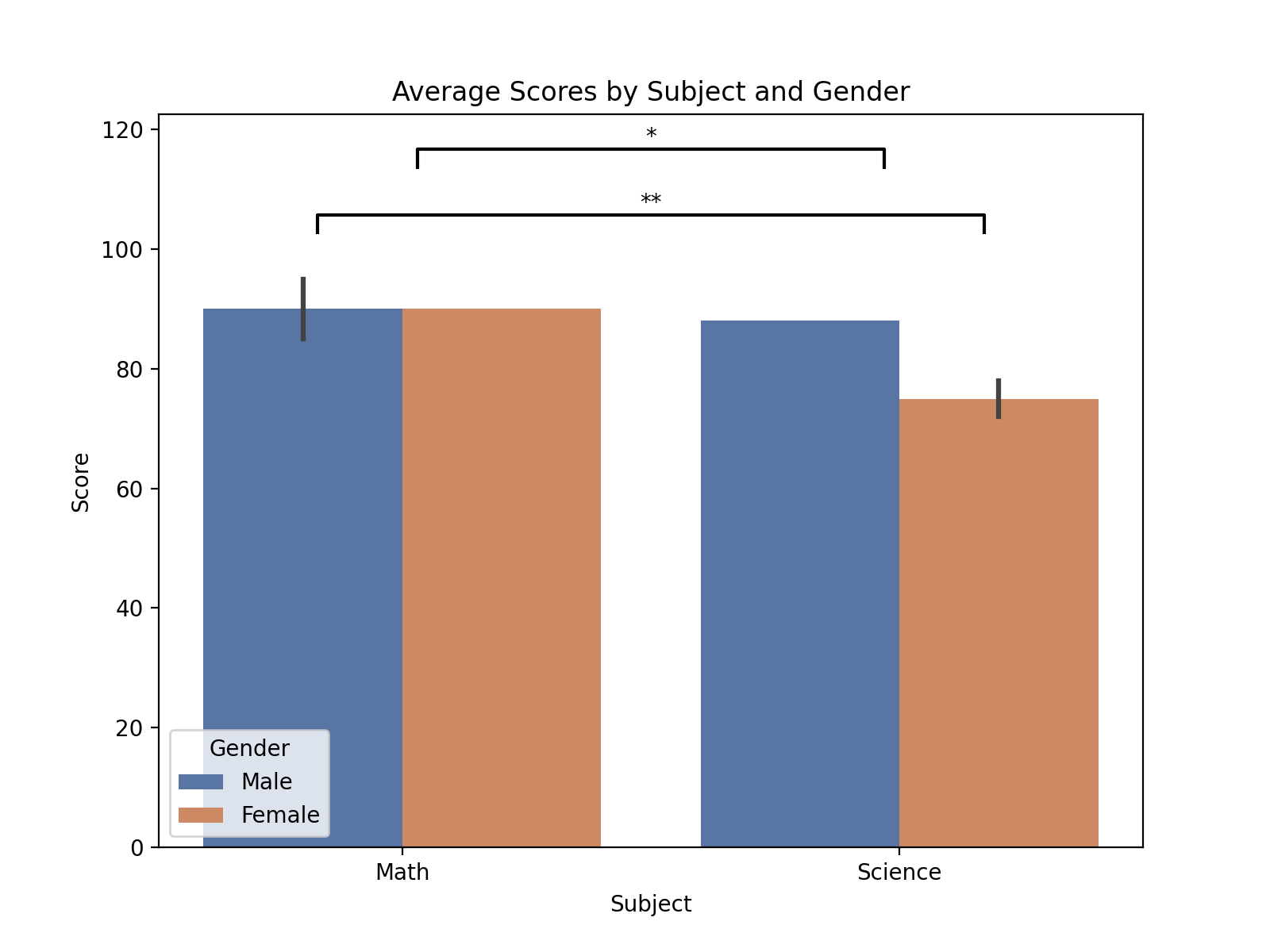
Plots with hue#
When using Seaborn plots with hue, pairs can be specified by including the hue label and its corresponding group in the tuple. These should then be combined with the other label, group tuple, and the p-value in the final tuple ((hue_label1, group1), (hue_label2, group2), pvalue). For example:
import matplotlib.pyplot as plt
import pandas as pd
import seaborn as sns

import starbars

# Example with hue used in plots
data = {
    'Student': ['A', 'B', 'C', 'D', 'E', 'F'],
    'Score': [85, 90, 88, 72, 95, 78],
    'Subject': ['Math', 'Math', 'Science', 'Science', 'Math', 'Science'],
    'Gender': ['Male', 'Female', 'Male', 'Female', 'Male', 'Female']
}
df = pd.DataFrame(data)
plt.figure(figsize=(8, 6))
plot = sns.barplot(data=df, x='Subject', y='Score', hue='Gender', palette='deep')
plt.title("Average Scores by Subject and Gender")
plt.xlabel("Subject")
plt.ylabel("Score")

annotations = [(('Male', 'Math'), ('Female', 'Science'), 0.01), ('Science', 'Math', 0.03)]
starbars.draw_annotation(annotations)

plt.show()
(Source code, png, hires.png, pdf)